import pandas as pd
import numpy as np
import matplotlib.pyplot as plt在数据分析过程中,我们常常碰到需要快速绘图的场景。比如,在回归分析前看一下 y 和 x 的散点图。对于这类需求,pandas 提供了一个 pandas.DataFrame.plot 方法可以方便快捷地实现可视化。pandas.DataFrame.plot 方法是对 matplotlib.axes.Axes.plot 的封装,所以在调用该方法前,我们需要导入 matplotlib 包。
首先我们生成一个 10\times4 的 DataFrame,在接下来的绘图中,我们都使用该数据作为示例。
Note:
np.random.randn(x, y)返回来自标准正态分布的样本,样本量为 x \times y。pd.date_range()返回固定频率的时间索引。
ts = pd.DataFrame(np.random.randn(10, 4), index = pd.date_range('1/1/2022', periods = 10), columns=['A','B','C','D'])
ts = ts.cumsum()
ts.head()| A | B | C | D | |
|---|---|---|---|---|
| 2022-01-01 | -0.275063 | -0.555619 | -0.299752 | -0.284489 |
| 2022-01-02 | 1.519735 | -0.615560 | -0.524613 | 0.406859 |
| 2022-01-03 | 1.539964 | -0.803152 | 0.471348 | 1.377172 |
| 2022-01-04 | 1.957513 | -0.881174 | 0.838217 | 2.101817 |
| 2022-01-05 | 3.216571 | -0.842396 | -0.144859 | 2.219383 |
下面,我们调用 plot 方法查看一下刚刚生成的数据。对 DataFrame 中的每一列数值型数据,pandas 默认使用折线图进行绘制。
ts.plot()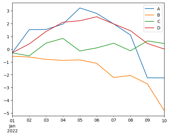
pandas 也支持对 Series 类型调用 plot 方法,因此我们也可以对任意一列进行绘图。比如,我们看一下 A 列数据:
ts['A'].plot()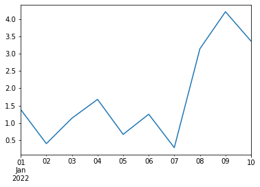
除了折线图,plot 方法还支持其他类图的绘制,可以通过 kind 参数实现。比如,我们可以看一下 A 列数据与 B 列数据的散点图。
ts.plot(x='A', y='B', kind='scatter')
此外,pandas 也提供另外一种方式来简化调用,即使用 DataFrame.plot.scatter() 的方式来调用:
ts.plot.scatter(x='A', y='B')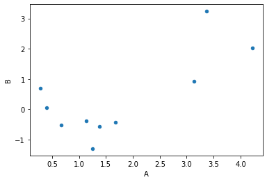
plot 方法支持如下图类的绘制:
- line : 折线图(line plot,默认)
- bar : 柱状图(vertical bar plot)
- barh : 横向柱状图(horizontal bar plot)
- hist : 直方图(histogram)
- box : 箱型图(box plot)
- kde : 核密度估计图(Kernel Density Estimation plot)
- density : same as ‘kde’
- area : 面积图(area plot)
- pie : 饼图(pie plot)
- scatter : 散点图(scatter plot,DataFrame only)
- hexbin : 六边形图(hexbin plot,DataFrame only)
有时候,我们希望把每一列数据绘制在一张子图上。在调用 plot 方法时,将 subplots 参数设置为 true 即可实现。
ts.plot(subplots=True)array([<AxesSubplot:>, <AxesSubplot:>, <AxesSubplot:>, <AxesSubplot:>],
dtype=object)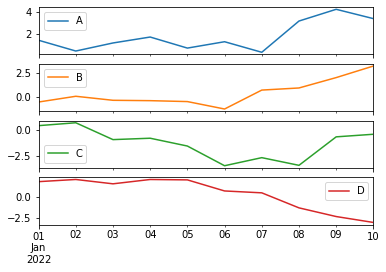
进一步,我们可以使用 layout 参数为子图排版:
ts.plot(subplots=True, layout=(2,2))array([[<AxesSubplot:>, <AxesSubplot:>],
[<AxesSubplot:>, <AxesSubplot:>]], dtype=object)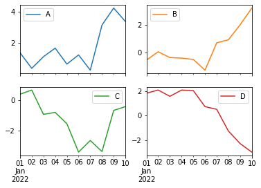
plot 方法中有一个 ax 参数可以接收一个 matplotlib 坐标轴对象(matplotlib axes object),这样我们便可以在 matplotlib axes 对象上利用 plot 方法画图。这意味着,我们可以使用 matplotlib 提供的方法对图像进行定制。
ts.indexDatetimeIndex(['2022-01-01', '2022-01-02', '2022-01-03', '2022-01-04',
'2022-01-05', '2022-01-06', '2022-01-07', '2022-01-08',
'2022-01-09', '2022-01-10'],
dtype='datetime64[ns]', freq='D')fig, axs = plt.subplots(figsize=(12,4), dpi=500)
ts.plot.bar(ax=axs, align='center', grid=True, title='NO$_2$ concentration Bar Plot')
for label in axs.xaxis.get_ticklabels():
label.set_color('darkblue')
label.set_rotation(30)
label.set_fontsize(8)
axs.set_ylabel("NO$_2$ concentration")Text(0, 0.5, 'NO$_2$ concentration')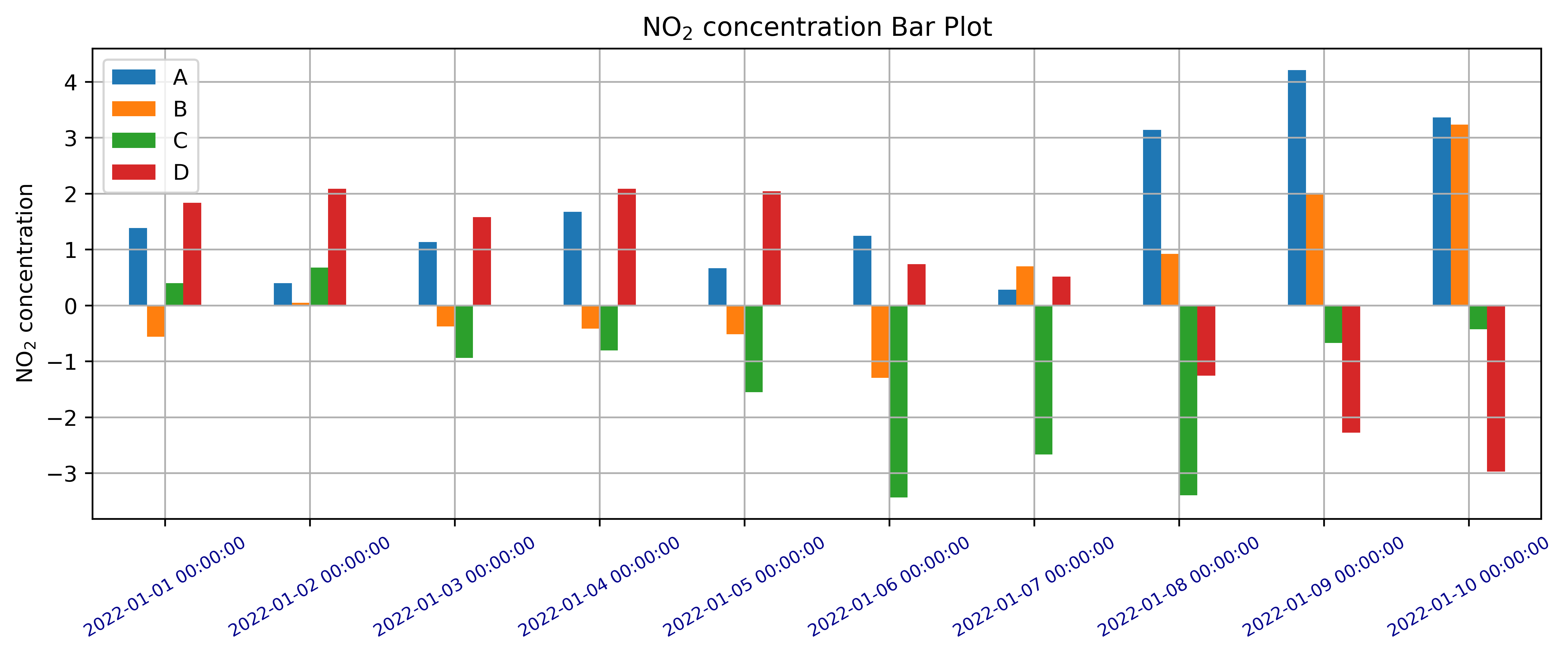
fig, axs = plt.subplots(figsize=(12,4), dpi=500)
ts.plot.bar(ax=axs, align='center', grid=True, title='NO$_2$ concentration Bar Plot')
axs.set_xticks(range(len(ts.index)))
axs.set_xticklabels([i.strftime('%Y-%m-%d') for i in ts.index], rotation=30)
[Text(0, 0, '2022-01-01'),
Text(1, 0, '2022-01-02'),
Text(2, 0, '2022-01-03'),
Text(3, 0, '2022-01-04'),
Text(4, 0, '2022-01-05'),
Text(5, 0, '2022-01-06'),
Text(6, 0, '2022-01-07'),
Text(7, 0, '2022-01-08'),
Text(8, 0, '2022-01-09'),
Text(9, 0, '2022-01-10')]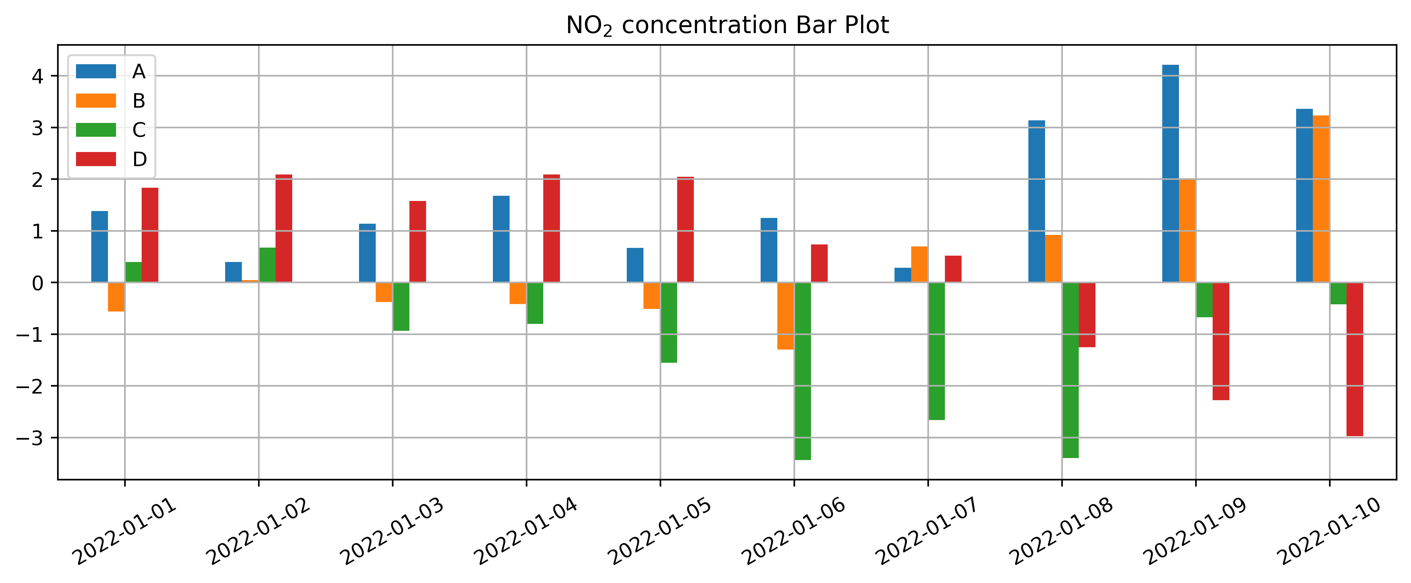
fig.savefig('no2_concentration.png')