Code
import matplotlib.pyplot as plt
import numpy as np
import pandas as pd
from sklearn.datasets import load_iris
import math这篇博客记录利用 matplotlib 进行科研绘图的一列案例,部分案例来自于这篇博客。
import matplotlib.pyplot as plt
import numpy as np
import pandas as pd
from sklearn.datasets import load_iris
import mathdata = load_iris()
sepal_length = data["data"][:, 0]
sepal_width = data["data"][:, 1]fig, ax = plt.subplots(figsize=(10, 6), dpi=100, layout="constrained")
# 设置是否显示图像边框
ax.spines["top"].set_visible(False)
ax.spines["bottom"].set_visible(True)
ax.spines["bottom"].set_color("grey")
ax.spines["right"].set_visible(False)
ax.spines["left"].set_visible(False)
ax.tick_params(
axis="both",
which="both",
bottom=True, # 显示底部刻度线
top=False,
labelbottom=True,
left=False, # 不显示左侧刻度线
right=False,
labelleft=True,
color="grey",
labelcolor="grey",
)
# 设置 x y 轴刻度范围,避免不必要的空白
ax.set_ylim([sepal_width.min() - 0.5, math.ceil(sepal_length.max())])
ax.set_xlim([0, 150])
# 设置 x y 轴刻度和刻度标签
# 根据原始数据范围,设置刻度时灵活使用 int 向下取整和 math.ceil 向上取整
ax.set_yticks(
range(int(sepal_width.min()), math.ceil(sepal_length.max()) + 1, 1),
[
str(x)
for x in range(int(sepal_width.min()), math.ceil(sepal_length.max()) + 1, 1)
],
fontsize=12,
)
ax.set_xticks(range(0, 151, 30), [str(x) for x in range(0, 151, 30)], fontsize=12)
# 在图上提供刻度线
# 以帮助观众沿着坐标轴刻度进行追踪
# 可以设置为虚线和浅色,以免遮挡主要的数据线
# 刻度线设置注意与 y 轴刻度一致
for y in range(int(sepal_width.min()), math.ceil(sepal_length.max()) + 1, 1):
ax.plot(
range(len(sepal_length)), [y] * len(sepal_length), "--", lw=0.5, color="grey"
)
ax.plot(
range(len(sepal_length)),
sepal_length,
color="black",
linestyle="-",
linewidth=0.8,
label="sepal length",
)
ax.plot(
range(len(sepal_width)),
sepal_width,
color="black",
linestyle="--",
linewidth=0.8,
label="sepal width",
)
# ax.set_xlabel("xlabel", fontsize=12)
# 使用 labelpad 灵活设置 y 轴标签与 y 轴距离
ax.set_ylabel("sepal length and width(cm)", fontsize=12, labelpad=8)
# 使用 bbox_to_anchor 和 loc 定位图例位置
# nloc 设置行列数;frameon 设置边框显示
ax.legend(bbox_to_anchor=(0.5, -0.15), loc="lower center", ncol=2, frameon=False)
plt.show()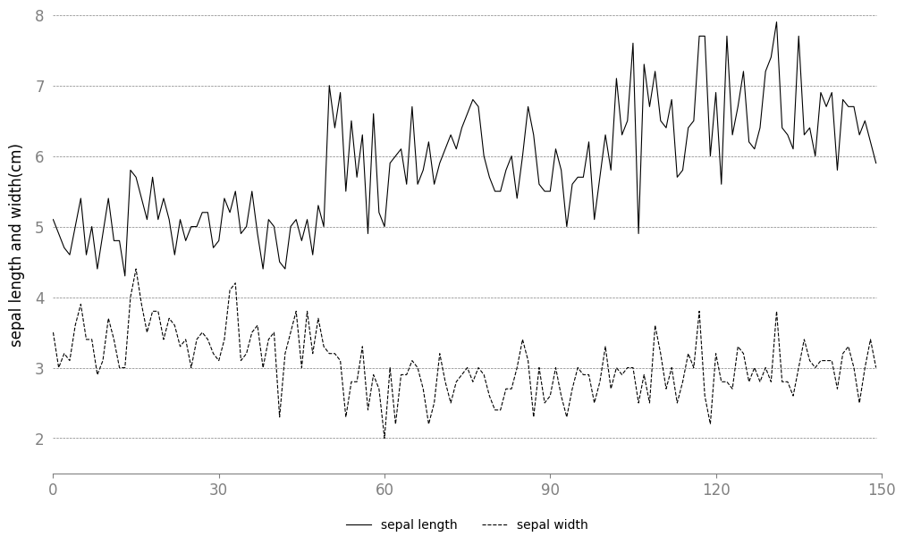
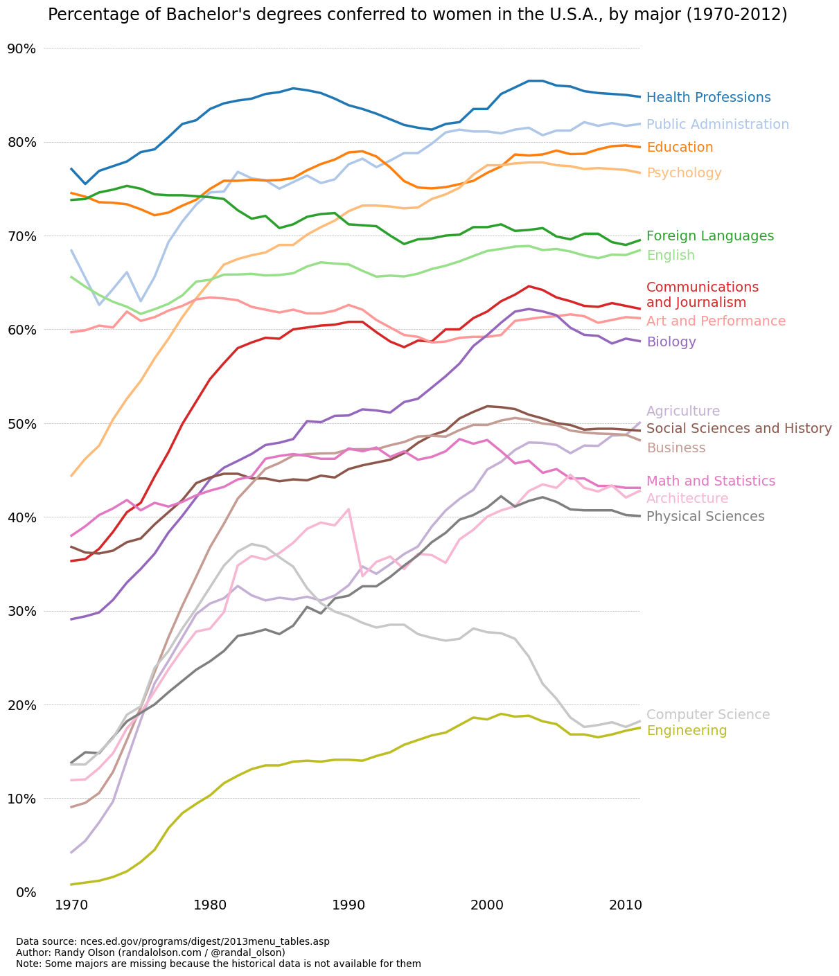
gender_degree_data = pd.read_csv(
    "http://www.randalolson.com/assets/2014/06/percent-bachelors-degrees-women-usa.csv"
)tableau20 = [
(31, 119, 180),
(174, 199, 232),
(255, 127, 14),
(255, 187, 120),
(44, 160, 44),
(152, 223, 138),
(214, 39, 40),
(255, 152, 150),
(148, 103, 189),
(197, 176, 213),
(140, 86, 75),
(196, 156, 148),
(227, 119, 194),
(247, 182, 210),
(127, 127, 127),
(199, 199, 199),
(188, 189, 34),
(219, 219, 141),
(23, 190, 207),
(158, 218, 229),
]
# 将RGB值缩放到[0, 1]的范围内
for i in range(len(tableau20)):
r, g, b = tableau20[i]
tableau20[i] = (r / 255.0, g / 255.0, b / 255.0)fig, ax = plt.subplots(figsize=(12, 14), layout="constrained")
# 去除图像的边框
ax.spines["top"].set_visible(False)
ax.spines["bottom"].set_visible(False)
ax.spines["right"].set_visible(False)
ax.spines["left"].set_visible(False)
# 保证 x 轴刻度处于底部
# 保证 y 轴刻度处于左侧
ax.get_xaxis().tick_bottom()
ax.get_yaxis().tick_left()
# 设置 x y 轴刻度范围,避免不必要的空白
ax.set_ylim([0, 90])
ax.set_xlim([1968, 2014])
# 设置 x y 轴刻度和刻度标签
ax.set_yticks(range(0, 91, 10), [str(x) + "%" for x in range(0, 91, 10)], fontsize=14)
ax.set_xticks(
range(1970, 2011, 10), [str(x) for x in range(1970, 2011, 10)], fontsize=14
)
# 在图上提供刻度线
# 以帮助观众沿着坐标轴刻度进行追踪
# 可以设置为虚线和浅色,以免遮挡主要的数据线
for y in range(10, 91, 10):
ax.plot(
range(1968, 2012),
[y] * len(range(1968, 2012)),
"--",
lw=0.5,
color="black",
alpha=0.3,
)
# 去除 x y 轴刻度上的刻度指示线
plt.tick_params(
axis="both",
which="both",
bottom=False,
top=False,
labelbottom=True,
left=False,
right=False,
labelleft=True,
)
majors = [
"Health Professions",
"Public Administration",
"Education",
"Psychology",
"Foreign Languages",
"English",
"Communications\nand Journalism",
"Art and Performance",
"Biology",
"Agriculture",
"Social Sciences and History",
"Business",
"Math and Statistics",
"Architecture",
"Physical Sciences",
"Computer Science",
"Engineering",
]
# 使用 text() 方法精确添加图例
for rank, column in enumerate(majors):
# Plot each line separately with its own color, using the Tableau 20
# color set in order.
ax.plot(
gender_degree_data.Year.values,
gender_degree_data[column.replace("\n", " ")].values,
lw=2.5,
color=tableau20[rank],
)
# Add a text label to the right end of every line. Most of the code below
# is adding specific offsets y position because some labels overlapped.
y_pos = gender_degree_data[column.replace("\n", " ")].values[-1] - 0.5
if column == "Foreign Languages":
y_pos += 0.5
elif column == "English":
y_pos -= 0.5
elif column == "Communications\nand Journalism":
y_pos += 0.75
elif column == "Art and Performance":
y_pos -= 0.25
elif column == "Agriculture":
y_pos += 1.25
elif column == "Social Sciences and History":
y_pos += 0.25
elif column == "Business":
y_pos -= 0.75
elif column == "Math and Statistics":
y_pos += 0.75
elif column == "Architecture":
y_pos -= 0.75
elif column == "Computer Science":
y_pos += 0.75
elif column == "Engineering":
y_pos -= 0.25
ax.text(2011.5, y_pos, column, fontsize=14, color=tableau20[rank])
# title() 方法会将标题居中显示在图上,但并不会居中于整个图形
# 因此使用 text() 方法显示标题
ax.text(
1995,
93,
"Percentage of Bachelor's degrees conferred to women in the U.S.A."
", by major (1970-2012)",
fontsize=17,
ha="center",
)
# 标示数据来源和 copyright
ax.text(
1966,
-8,
"Data source: nces.ed.gov/programs/digest/2013menu_tables.asp"
"\nAuthor: Randy Olson (randalolson.com / @randal_olson)"
"\nNote: Some majors are missing because the historical data "
"is not available for them",
fontsize=10,
)
# bbox_inches='tight' 去除图像边缘的多余空白
# plt.savefig("percent-bachelors-degrees-women-usa.png", bbox_inches="tight")
plt.show()